tidyplots绘制RNA-seq发表级美图实战
tidyplots绘制RNA-seq发表级美图实战
01
安装、基础语法
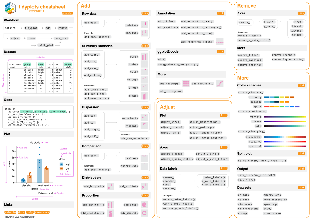 指令速览,来源:tidyplots官方文档
想象一下,你花了三天时间调ggplot2的参数,结果图还是丑得让审稿人怀疑人生。而tidyplots的出现,就像是给我们这些"美术废柴"送来了救星!
tidyplots的三大优势:
- • 开箱即美:默认配色就很专业,不用纠结颜色搭配
- • 语法简洁:告别那些令人头大的theme()函数
- • 发表友好:生成的图表直接符合大多数期刊要求
简单来说,就是让你用更少的代码,做出更美的图!
安装
# 稳定版
install.packages("tidyplots")
# 开发版
# install.packages("pak")
#pak::pak("jbengler/tidyplots")

# 加载必要的包
library(tidyverse)
library(tidyplots)
准备数据
在开始画图之前,第一件事就是确保你的数据是整洁的(tidy)。这不仅适用于tidyplots,实际上,整洁数据是数据分析流的基石,统计检验、机器学习、质量控制等等都需要整洁的数据。
具体来说,整洁数据要满足三个"黄金法则":
- • 每个变量 都要有专属的列(比如基因名、表达量、样本组别各占一列)
- • 每个观测值 都要有专属的行(每一行代表一个具体的测量结果)
- • 每个数值 都要有专属的单元格(一个格子只放一个数据)
举个例子,假设你有一个RNA-seq的表达矩阵exp:
# 典型的RNA-seq矩阵格式(宽格式)
#           Sample1  Sample2  Sample3  Sample4
# Gene1         120      89      156      78
# Gene2          45      67       23      89
# Gene3         234     178      267     145
# ...
你可以使用tidyr和dplyr(都是tidyverse的一部分)转换为整洁格式(也称长格式):
#library(tidyr)
#library(dplyr)

# 将宽格式转换为长格式(整洁格式)
exp_tidy <- exp %>%
  # 把行名(基因名)转为一列
  tibble::rownames_to_column("Gene") %>%
  # 将所有样本列转换为两列:Sample和Expression
  pivot_longer(
    cols = -Gene,                    # 除了Gene列,其他都要转换
    names_to = "Sample",             # 列名变成Sample列
    values_to = "Expression"         # 数值变成Expression列
  )

# 结果看起来像这样:
# Gene    Sample    Expression
# Gene1   Sample1          120
# Gene1   Sample2           89
# Gene1   Sample3          156
# Gene1   Sample4           78
# Gene2   Sample1           45
# Gene2   Sample2           67
# ...
基础绘图
tidyplots的“管道”(|>)跟dplyr的管道(%>%)作用一致,目的是把前一步骤的结果传输到后一步骤作为输入。快捷键是Cmd+Shift+M (或Ctrl+Shift+M)。
我们使用演示数据study:
head(study)
# A tibble: 6 × 7
  treatment group   dose  participant   age sex    score
  <chr>     <chr>   <chr> <chr>       <dbl> <chr>  <dbl>
1 A         placebo high  p01            23 female     2
2 A         placebo high  p02            45 male       4
3 A         placebo high  p03            32 female     5
4 A         placebo high  p04            37 male       4
5 A         placebo high  p05            24 female     6
6 B         placebo low   p06            23 female     9
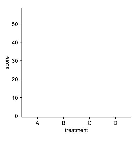
1. tidyplot()主函数
将数据传输到主函数,并定义x、y轴,颜色等
study |>
  tidyplot(x = treatment, y = score)
2. 添加图表元素
“添加”系列函数以add_*()开头,可以用于添加数据、图表、注释、线框、统计结果等等。
添加数据点:
study |>
  tidyplot(x = treatment, y = score, color=treatment) |>
  add_data_points()
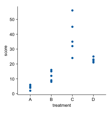
添加条形图、误差棒,并按照treatment着色:
study |>
  tidyplot(x = treatment, y = score, color=treatment) |>
  add_data_points() |>
  add_mean_bar(alpha = 0.4) |> # 条形图,透明度0.4
  add_sem_errorbar() # SEM误差棒
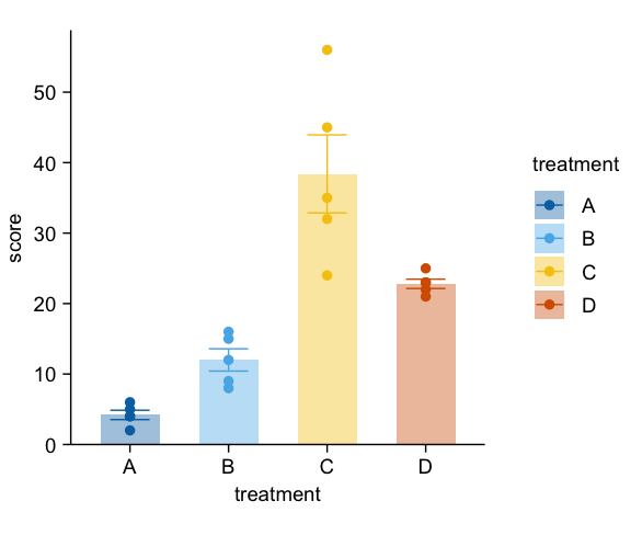
添加统计检验:
study |>
  tidyplot(x = treatment, y = score, color=treatment) |>
  add_data_points() |>
  add_mean_bar(alpha = 0.4) |>
  add_sem_errorbar() |>
  add_test_asterisks(method="t_test", p.adjust.by = "group", ref.group = "A", hide_info = TRUE) # T检验,根据组别更正p-value,参照组为A,不显示统计信息
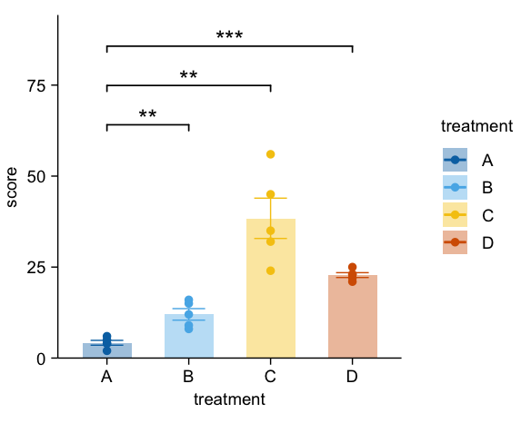
是不是已经像模像样了?
3. 移除/修改图表元素
“移除”系列函数由remove_*() 开头,“修改”系列函数由adjust_*()开头。比如:
移除图注标题、y轴, 更改x轴文字角度:
study |>
  tidyplot(x = group, y = score, color = dose) |>
  add_data_points() |>
  add_mean_dash() |> # 蜂群图
  add_sem_errorbar() |>
  adjust_x_axis(rotate_labels=45)|> # 旋转45度
  remove_legend_title() |> # 移除图注标题
  remove_y_axis() # 移除y轴
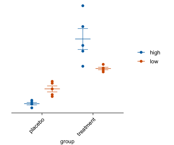
更改标题、颜色等:
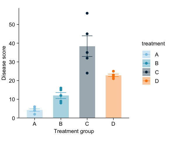
study |>
  tidyplot(x = treatment, y = score, color = treatment) |>
  add_data_points() |>
  add_mean_bar(alpha = 0.4) |>
  add_sem_errorbar() |>
  adjust_x_axis_title("Treatment group") |> # 更改X轴标题
  adjust_y_axis_title("Disease score") |> # 更改Y轴标题
  adjust_colors(new_colors = colors_discrete_seaside) # 更改颜色
重排序(图略):
· sort_x_axis_labels() 按照数据从小到大排列x轴元素
· reorder_x_axis_labels() 自定义顺序排列x轴
· rename_x_axis_labels() 重命名x轴元素
4. 更改画布大小、字体、分辨率、导出图片
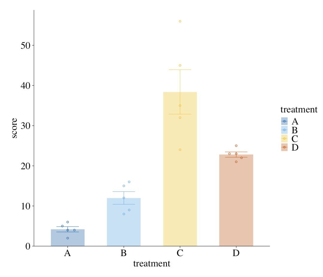
adjust_font()更改的是全局字体和大小。如果有单独更改的需求,比如只需要改x轴标题,可以使用对应元素的adjust_*()函数,如adjust_x_axis_title()。
study |>
  tidyplot(x = treatment, y = score, color = treatment) |>
  add_data_points_beeswarm(shape = 1) |>
  add_mean_bar(alpha = 0.4) |>
  add_sem_errorbar() |>
  adjust_font(fontsize = 15, family="serif") |> # 全局15号字, 新罗马字体
  adjust_size(width = 5, height = 5, unit="in") |> # 更改画布为5x5 inch
  save_plot("my_plot.pdf", dpi=300) # 导出到pdf, 分辨率为300dpi
到这里,相信各位已经对tidyplots绘图的基本语法有了相当的了解。接下来进入RNA-seq常用图表的实战吧~
02
实战:基因表达蜂群图
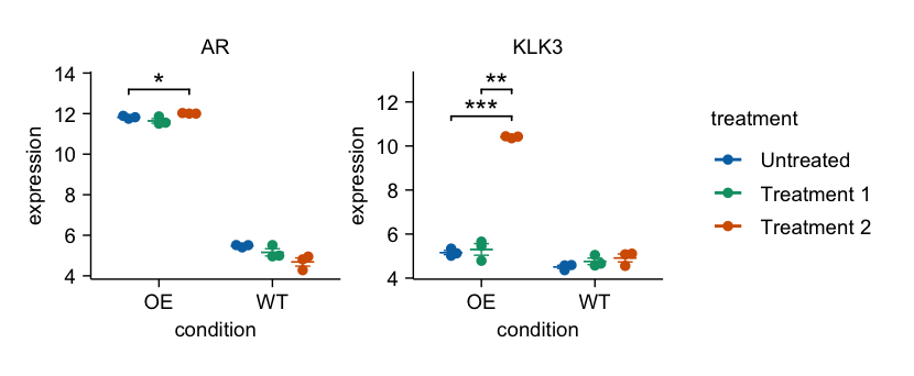
这里,exp是标准化后的表达矩阵,sampleinfo是一个含有样本元信息的data.frame。我们首先要把表达矩阵转化为长格式,用于绘图(跟ggplot类似)。
# 转化为长格式
exp <- exp%>%
  as.data.frame()%>%
  rownames_to_column("gene_symbol")%>%
  pivot_longer(cols =-"gene_symbol", names_to ="sample", values_to ="expression")%>%
mutate(
    condition = sampleinfo$condition[match(sample, sampleinfo$samples)],
    treatment = sampleinfo$treatment[match(sample, sampleinfo$samples)]
  )

# 使用tidyplots绘图
exp|>
  filter(gene_symbol %in%c("AR","KLK3"))|>
  tidyplot(x = condition, y =expression, color = treatment)|>
  add_mean_dash()|>
  add_sem_errorbar()|>
  add_data_points_beeswarm()|>
  add_test_asterisks(hide_info =TRUE)|>
  split_plot(by = gene_symbol)
03
实战:基因表达热图
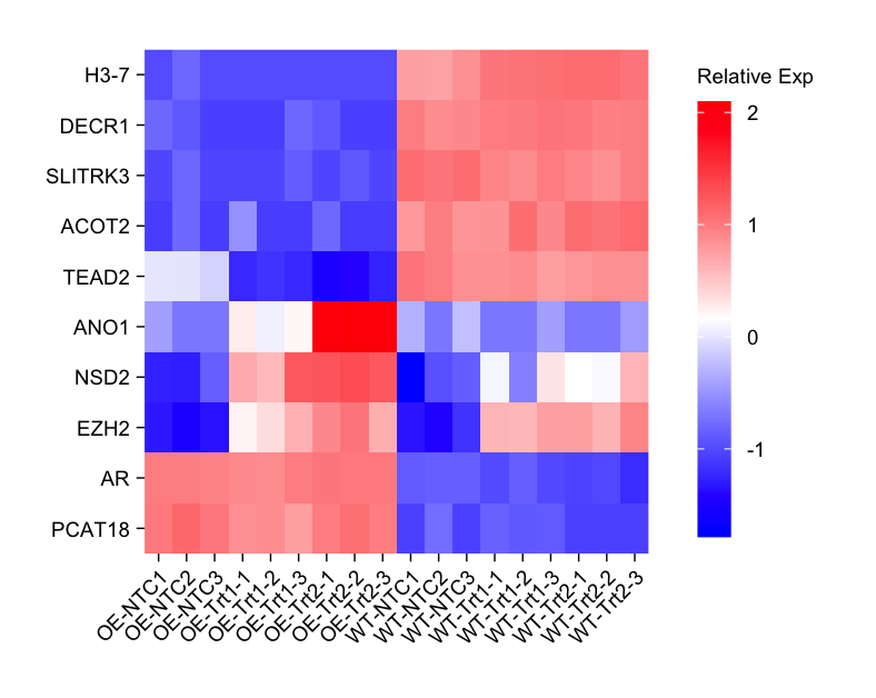
genes_interest <- c(
"H3-7","DECR1","SLITRK3","ACOT2","TEAD2",
"ANO1","NSD2","EZH2","AR","PCAT18"
)
exp|>
  dplyr::filter(gene_symbol %in% genes_interest)|>
  dplyr::mutate(gene_symbol = factor(gene_symbol, levels = rev(genes_interest)))|>
  tidyplot(x = sample, y = gene_symbol, color =expression)|>
  add_heatmap(scale ="row", rotate_labels =TRUE)|>
  adjust_size(height =100, width=80)|>
  adjust_theme_details(legend.key.height = unit(1,"null"))|>
  adjust_legend_title("Relative Exp")|>
  remove_x_axis_title()|>
  remove_y_axis_title()
04
实战:火山图
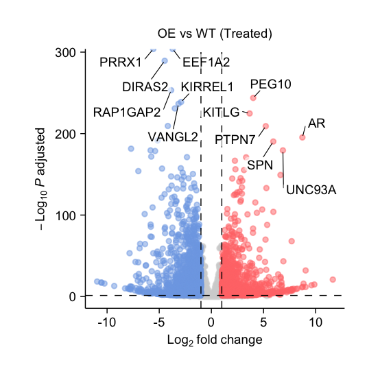
假设我们已经使用DESeq2完成了差异基因分析,且结果保存在dds。绘制火山图的代码如下:
df <- results(dds, contrast=c("group","OE_trt1","WT_trt1"))%>%
  as.data.frame()%>%
  mutate(
    neg_log10_padj =-log10(padj),
    direction = if_else(log2FoldChange >0,"up","down",NA),
    candidate =abs(log2FoldChange)>=1& padj <0.05,
    gene_id = rownames(.)
)

df |>
  tidyplot(x = log2FoldChange, y = neg_log10_padj)|>
  add_data_points(data = filter_rows(!candidate),
                  color ="lightgrey", rasterize =TRUE)|>
  add_data_points(data = filter_rows(candidate, direction =="up"),
                  color ="#FF7777", alpha =0.5)|>
  add_data_points(data = filter_rows(candidate, direction =="down"),
                  color ="#7DA8E6", alpha =0.5)|>
  add_reference_lines(x =c(-1,1), y =-log10(0.05))|>
  add_data_labels_repel(data = min_rows(padj,6, by = direction), label = gene_id,
                        color ="#000000", min.segment.length =0, background =TRUE)|>
  adjust_x_axis_title("$Log[2]~fold~change$")|>
  adjust_y_axis_title("$-Log[10]~italic(P)~adjusted$")|>
  add_title("OE vs WT (Treated)")
05
实战:PCA图
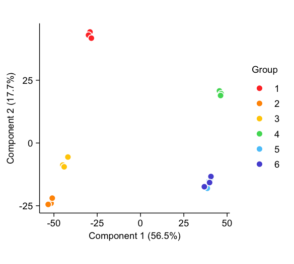
# 假设exp是标准化的表达矩阵,sampleinfo有组别信息
# 进行PCA计算
pca_result <- prcomp(t(exp)) # pca
pc_scores <- as.data.frame(pca_result$x) # 提取pc scores
var_explained <- pca_result$sdev^2 / sum(pca_result$sdev^2) # 计算百分比
pca_data <- cbind(pc_scores, sampleinfo) # 生成绘图数据
# 绘图
pca_data |>
  tidyplot(x = PC1, y = PC2, color = group) |>
  add_data_points(size = 1.3, white_border = TRUE) |>
  adjust_x_axis_title(paste0("Component 1 (", format_number(var_explained[1]*100), "%)")) |>
  adjust_y_axis_title(paste0("Component 2 (", format_number(var_explained[2]*100), "%)")) |>
  adjust_colors(colors_discrete_apple) |>
  adjust_legend_title("Group")
- End -
关注Bioinfo自习室,了解单细胞前沿、硬核单细胞教程和生信小技巧!想要追更,请给我们加一个小✨,不错过最新推送: