tidyplots in Practice: Publication-Quality Figures for RNA-seq

01
Installation and Basic Syntax
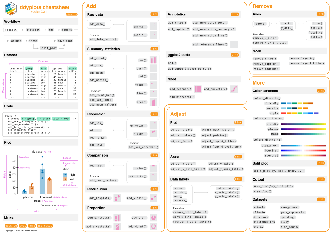 Quick-reference command overview (source: tidyplots official documentation)
Imagine spending three days tweaking ggplot2 parameters, only to end up with a figure so ugly it makes your reviewers question their life choices. The arrival of tidyplots is like a godsend for those of us who are artistically challenged!
Three big advantages of tidyplots:
- • Beautiful by default: The built-in colour palettes are professional from the start — no more agonising over colour choices.
- • Concise syntax: Say goodbye to the bewildering
theme()function maze. - • Publication-ready: Figures generated are directly compatible with the formatting requirements of most journals.
In short: less code, better figures!
Installation
# Stable version
install.packages("tidyplots")
# Development version
# install.packages("pak")
#pak::pak("jbengler/tidyplots")

# Load required packages
library(tidyverse)
library(tidyplots)
Preparing Your Data
Before plotting, the first priority is making sure your data is tidy. This isn't just a requirement of tidyplots — tidy data is the foundation of the entire data analysis pipeline, from statistical testing and machine learning to quality control.
Concretely, tidy data must satisfy three "golden rules":
- • Every variable has its own dedicated column (e.g., gene name, expression level, and sample group each occupy a separate column).
- • Every observation has its own dedicated row (each row represents one specific measurement).
- • Every value occupies its own cell (one data point per cell).
For example, suppose you have an RNA-seq expression matrix exp:
# Typical RNA-seq matrix format (wide format)
#           Sample1  Sample2  Sample3  Sample4
# Gene1         120      89      156      78
# Gene2          45      67       23      89
# Gene3         234     178      267     145
# ...
You can use tidyr and dplyr (both part of tidyverse) to convert it to tidy (long) format:
#library(tidyr)
#library(dplyr)

# Convert wide format to long format (tidy format)
exp_tidy <- exp %>%
  # Convert row names (gene names) into a column
  tibble::rownames_to_column("Gene") %>%
  # Convert all sample columns into two columns: Sample and Expression
  pivot_longer(
    cols = -Gene,                    # All columns except Gene need to be converted
    names_to = "Sample",             # Column names become the Sample column
    values_to = "Expression"         # Values become the Expression column
  )

# The result looks like this:
# Gene    Sample    Expression
# Gene1   Sample1          120
# Gene1   Sample2           89
# Gene1   Sample3          156
# Gene1   Sample4           78
# Gene2   Sample1           45
# Gene2   Sample2           67
# ...
Basic Plotting
The pipe operator (|>) in tidyplots functions the same way as dplyr's %>%: it passes the result of the previous step as input to the next. The keyboard shortcut is Cmd+Shift+M (or Ctrl+Shift+M).
We'll use the built-in demo dataset study:
head(study)
# A tibble: 6 × 7
  treatment group   dose  participant   age sex    score
  <chr>     <chr>   <chr> <chr>       <dbl> <chr>  <dbl>
1 A         placebo high  p01            23 female     2
2 A         placebo high  p02            45 male       4
3 A         placebo high  p03            32 female     5
4 A         placebo high  p04            37 male       4
5 A         placebo high  p05            24 female     6
6 B         placebo low   p06            23 female     9
1. The tidyplot() main function
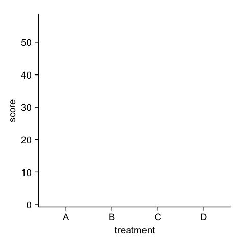
Pass data into the main function and define the x-axis, y-axis, and colour mapping:
study |>
  tidyplot(x = treatment, y = score)
2. Adding plot elements
Functions in the add_*() family are used to add data layers, chart elements, annotations, reference lines, and statistical results.
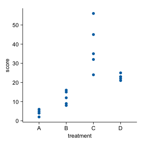
Add raw data points:
study |>
  tidyplot(x = treatment, y = score, color=treatment) |>
  add_data_points()
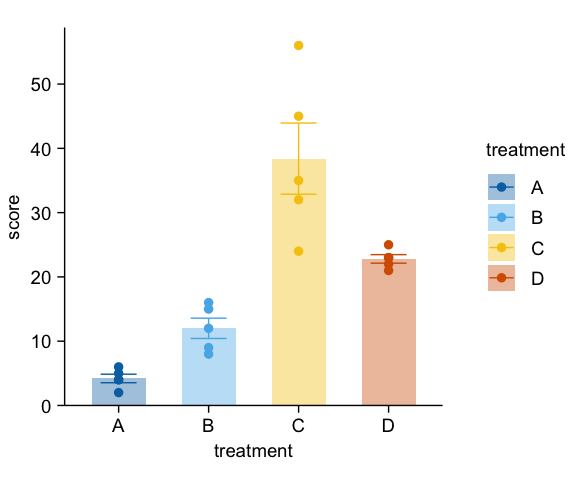
Add a bar chart and SEM error bars, coloured by treatment:
study |>
  tidyplot(x = treatment, y = score, color=treatment) |>
  add_data_points() |>
  add_mean_bar(alpha = 0.4) |> # Bar chart, alpha 0.4
  add_sem_errorbar() # SEM error bars
Add a statistical test:
study |>
  tidyplot(x = treatment, y = score, color=treatment) |>
  add_data_points() |>
  add_mean_bar(alpha = 0.4) |>
  add_sem_errorbar() |>
  add_test_asterisks(method="t_test", p.adjust.by = "group", ref.group = "A", hide_info = TRUE) # T-test, p-value adjusted by group, reference group A, hide statistics info
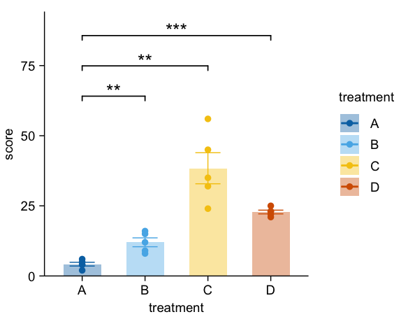
Already looking publication-worthy, isn't it?
3. Removing and modifying plot elements
The remove_*() family removes elements; the adjust_*() family modifies them. For example:
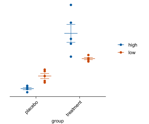
Remove the legend title and y-axis, and rotate the x-axis labels by 45°:
study |>
  tidyplot(x = group, y = score, color = dose) |>
  add_data_points() |>
  add_mean_dash() |> # Bee swarm plot
  add_sem_errorbar() |>
  adjust_x_axis(rotate_labels=45)|> # Rotate labels 45 degrees
  remove_legend_title() |> # Remove legend title
  remove_y_axis() # Remove y-axis
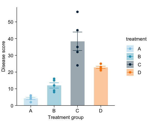
Change the axis titles and colour palette:
study |>
  tidyplot(x = treatment, y = score, color = treatment) |>
  add_data_points() |>
  add_mean_bar(alpha = 0.4) |>
  add_sem_errorbar() |>
  adjust_x_axis_title("Treatment group") |> # Change X-axis title
  adjust_y_axis_title("Disease score") |> # Change Y-axis title
  adjust_colors(new_colors = colors_discrete_seaside) # Change colors
Reordering labels (figures omitted):
· sort_x_axis_labels() — sorts x-axis elements by value (ascending)
· reorder_x_axis_labels() — arranges x-axis elements in a custom order
· rename_x_axis_labels() — renames x-axis elements
4. Adjusting canvas size, font, resolution, and exporting figures
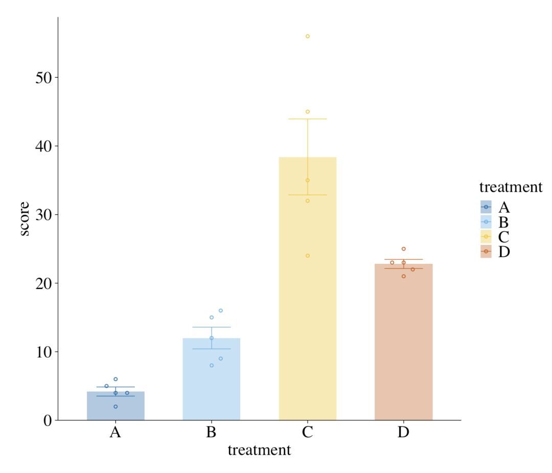
adjust_font() changes the global font family and size. For element-specific changes — for example, changing only the x-axis title — use the corresponding adjust_*() function such as adjust_x_axis_title().
study |>
  tidyplot(x = treatment, y = score, color = treatment) |>
  add_data_points_beeswarm(shape = 1) |>
  add_mean_bar(alpha = 0.4) |>
  add_sem_errorbar() |>
  adjust_font(fontsize = 15, family="serif") |> # Global 15pt font, Times New Roman
  adjust_size(width = 5, height = 5, unit="in") |> # Set canvas to 5x5 inches
  save_plot("my_plot.pdf", dpi=300) # Export to PDF, 300 dpi
By now, you should have a solid grasp of tidyplots's basic syntax. Let's move on to practical examples using common RNA-seq figure types!
02
Hands-On: Gene Expression Beeswarm Plot
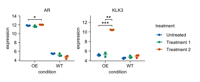
Here, exp is a normalised expression matrix and sampleinfo is a data.frame containing sample metadata. We first convert the expression matrix to long format for plotting (just as you would with ggplot2).
# Convert to long format
exp <- exp%>%
  as.data.frame()%>%
  rownames_to_column("gene_symbol")%>%
  pivot_longer(cols =-"gene_symbol", names_to ="sample", values_to ="expression")%>%
mutate(
    condition = sampleinfo$condition[match(sample, sampleinfo$samples)],
    treatment = sampleinfo$treatment[match(sample, sampleinfo$samples)]
  )

# Plot with tidyplots
exp|>
  filter(gene_symbol %in%c("AR","KLK3"))|>
  tidyplot(x = condition, y =expression, color = treatment)|>
  add_mean_dash()|>
  add_sem_errorbar()|>
  add_data_points_beeswarm()|>
  add_test_asterisks(hide_info =TRUE)|>
  split_plot(by = gene_symbol)
03
Hands-On: Gene Expression Heatmap
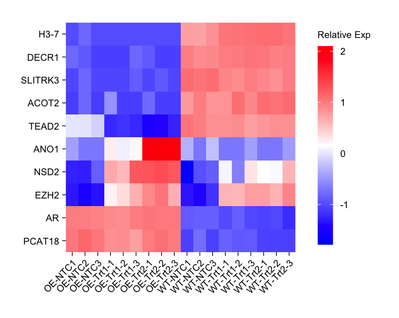
genes_interest <- c(
"H3-7","DECR1","SLITRK3","ACOT2","TEAD2",
"ANO1","NSD2","EZH2","AR","PCAT18"
)
exp|>
  dplyr::filter(gene_symbol %in% genes_interest)|>
  dplyr::mutate(gene_symbol = factor(gene_symbol, levels = rev(genes_interest)))|>
  tidyplot(x = sample, y = gene_symbol, color =expression)|>
  add_heatmap(scale ="row", rotate_labels =TRUE)|>
  adjust_size(height =100, width=80)|>
  adjust_theme_details(legend.key.height = unit(1,"null"))|>
  adjust_legend_title("Relative Exp")|>
  remove_x_axis_title()|>
  remove_y_axis_title()
04
Hands-On: Volcano Plot
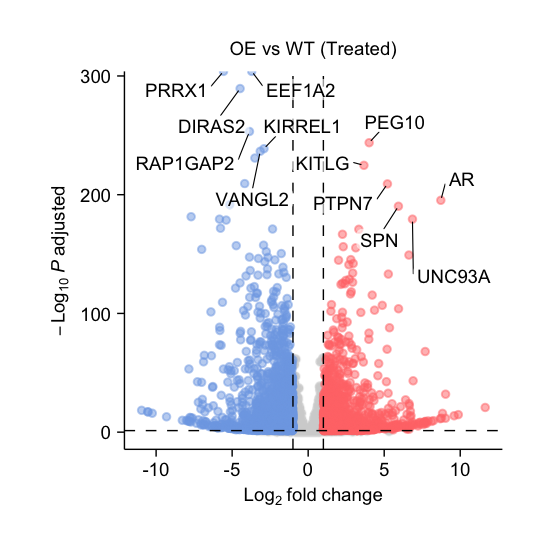
Assuming you have completed differential expression analysis using DESeq2 and the results are stored in dds, the code for a volcano plot is as follows:
df <- results(dds, contrast=c("group","OE_trt1","WT_trt1"))%>%
  as.data.frame()%>%
  mutate(
    neg_log10_padj =-log10(padj),
    direction = if_else(log2FoldChange >0,"up","down",NA),
    candidate =abs(log2FoldChange)>=1& padj <0.05,
    gene_id = rownames(.)
)

df |>
  tidyplot(x = log2FoldChange, y = neg_log10_padj)|>
  add_data_points(data = filter_rows(!candidate),
                  color ="lightgrey", rasterize =TRUE)|>
  add_data_points(data = filter_rows(candidate, direction =="up"),
                  color ="#FF7777", alpha =0.5)|>
  add_data_points(data = filter_rows(candidate, direction =="down"),
                  color ="#7DA8E6", alpha =0.5)|>
  add_reference_lines(x =c(-1,1), y =-log10(0.05))|>
  add_data_labels_repel(data = min_rows(padj,6, by = direction), label = gene_id,
                        color ="#000000", min.segment.length =0, background =TRUE)|>
  adjust_x_axis_title("$Log[2]~fold~change$")|>
  adjust_y_axis_title("$-Log[10]~italic(P)~adjusted$")|>
  add_title("OE vs WT (Treated)")
05
Hands-On: PCA Plot
# Assume exp is a normalized expression matrix, sampleinfo has group info
# Perform PCA
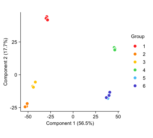
pca_result <- prcomp(t(exp)) # pca
pc_scores <- as.data.frame(pca_result$x) # Extract PC scores
var_explained <- pca_result$sdev^2 / sum(pca_result$sdev^2) # Calculate percentage of variance explained
pca_data <- cbind(pc_scores, sampleinfo) # Generate plotting data
# Plot
pca_data |>
  tidyplot(x = PC1, y = PC2, color = group) |>
  add_data_points(size = 1.3, white_border = TRUE) |>
  adjust_x_axis_title(paste0("Component 1 (", format_number(var_explained[1]*100), "%)")) |>
  adjust_y_axis_title(paste0("Component 2 (", format_number(var_explained[2]*100), "%)")) |>
  adjust_colors(colors_discrete_apple) |>
  adjust_legend_title("Group")
- End -
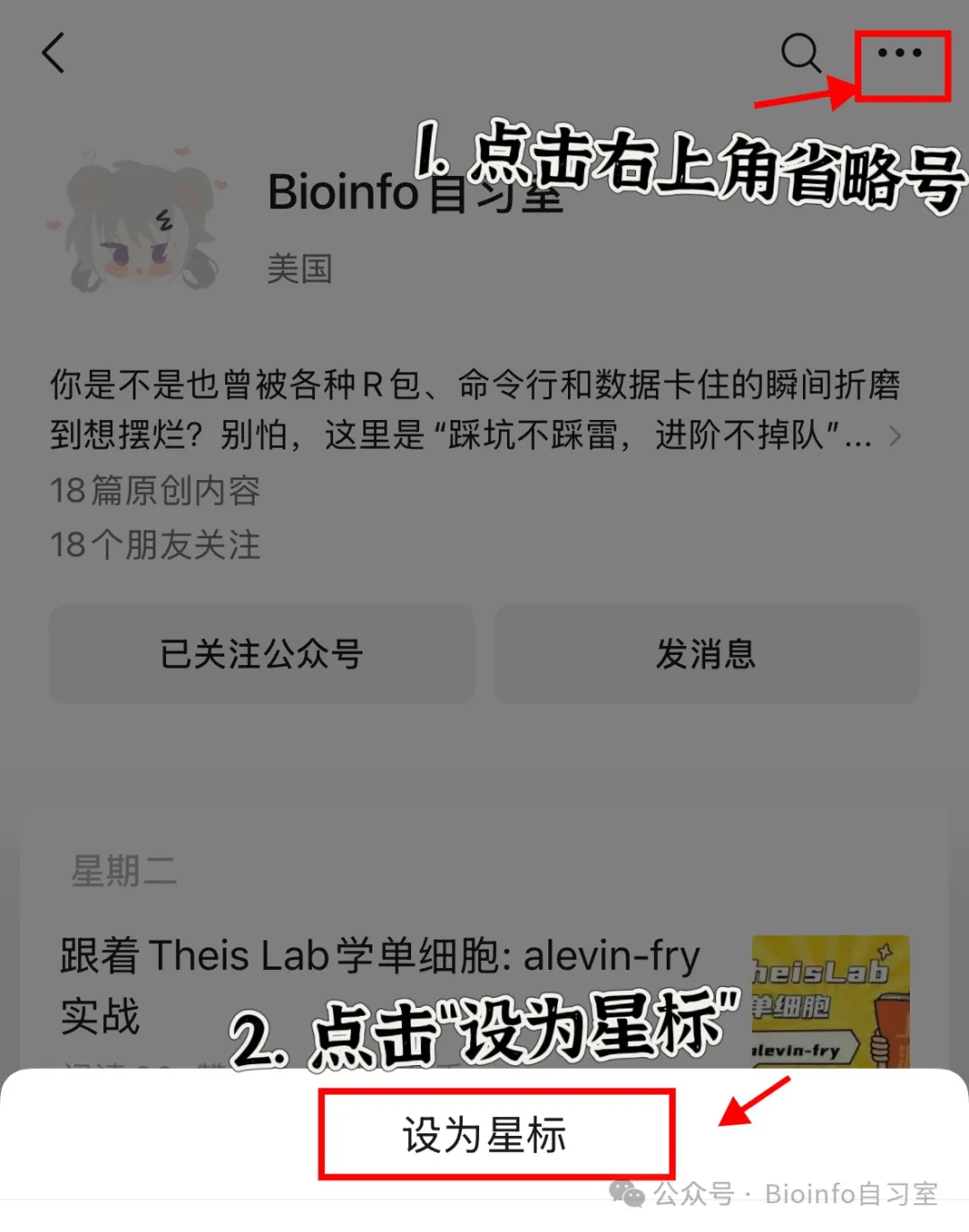
Follow Bioinfo Study Room for the latest in single-cell research, in-depth single-cell tutorials, and bioinformatics tips! To follow along, give us a star ✨ so you never miss the latest updates:
Originally posted on WeChat Official Account: bioinfo_studyroom