Single-Cell Analysis with Theis Lab: Taming High-Dimensional Data with Dimensionality Reduction
Single-Cell Best Practices
Dimensionality Reduction
SECTION PREVIEW
- Understanding the "curse of dimensionality" and its impact on single-cell analysis
- Grasping the principles and characteristics of PCA, t-SNE, and UMAP
- Hands-on: performing dimensionality reduction and visualization with Scanpy
- Learning to inspect data quality through dimensionality reduction plots
This section corresponds to Chapter 9: Dimension Reduction in the original book.
Single-cell RNA sequencing data is defined by its extreme dimensionality: each cell can carry expression information for 20,000–30,000 genes. Although we used feature selection in the previous chapter to filter out most "uninformative" genes, the remaining few thousand genes still leave the data in a very high-dimensional space. Today, we'll learn how dimensionality reduction compresses this high-dimensional data into just 2–3 dimensions — preserving the key information while making it amenable to visual exploration.
01 — The "Curse" of High-Dimensional Data
The Trouble with the Curse of Dimensionality
As far back as 1957, mathematician Richard Bellman coined the term "Curse of Dimensionality" — a phrase that sounds almost mystical but describes a very practical problem:
In theory, higher-dimensional data should contain more information. In practice, that's often not the case. High-dimensional data tends to harbor more noise and redundancy; adding more dimensions can actually hinder downstream analysis.
In single-cell data, this problem is particularly pronounced:
- Not all genes are informative for distinguishing cell types
- Co-expression relationships among genes create redundant information
- Distance calculations in high-dimensional space become unreliable
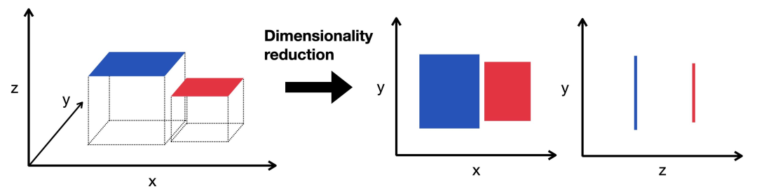
Illustration of dimensionality reduction
The Goal of Dimensionality Reduction
At its core, dimensionality reduction embeds high-dimensional data into a lower-dimensional space while simultaneously:
- Preserving the intrinsic structure: the similarity relationships between cells remain intact
- Removing redundant information: compressing data to improve computational efficiency
- Enabling visualization: humans find 2D and 3D representations easiest to interpret
Think of it like photographing a three-dimensional sculpture — we want to find the angle that best captures the sculpture's defining features.
02 — The Major Dimensionality Reduction Methods
A recent comparative study (Xing et al., 2021) found that t-SNE achieves the best overall performance, UMAP excels in stability, and while PCA is simpler, it still has unique value. Let's walk through each method.
PCA: The Classic Linear Method
How it works
Principal Component Analysis (PCA) uses an orthogonal transformation to convert the original gene expression data into a set of linearly uncorrelated principal components (PCs). These components are ranked by variance, with the top PCs capturing the major sources of variation in the data.
Advantages
- Computationally efficient with interpretable results
- Each principal component carries a concrete biological meaning
- Commonly used as input for downstream analyses (typically the top 10–50 PCs)
Limitations
Because single-cell data is sparse and highly non-linear (think of dropout events), PCA's linear approach has limited power for visualization. Nevertheless, it remains an essential preprocessing step before non-linear dimensionality reduction.
t-SNE: The Star of Non-Linear Dimensionality Reduction
How it works
t-SNE (t-distributed Stochastic Neighbor Embedding) is a graph-based non-linear method that projects high-dimensional data into 2D or 3D space. Its core idea:
- In high-dimensional space, model the similarity between data points using a Gaussian distribution
- In low-dimensional space, reconstruct these similarities using a t-distribution
- Use gradient descent to minimize the divergence between the two similarity distributions
Characteristics
- Excellent at preserving local structure — clearly separates distinct cell populations
- Produces visually compelling plots; a popular choice for publication figures
UMAP: The Rising Challenger
How it works
UMAP (Uniform Manifold Approximation and Projection) is also a graph-based non-linear method, conceptually similar to t-SNE. It first constructs a graph representation of the high-dimensional data, then optimizes a low-dimensional graph to match the structure of the original as closely as possible.
Characteristics
- Better at preserving global structure than t-SNE
- Generally faster to compute than t-SNE
- More stable — repeated runs produce more consistent results
Research shows that when parameters are well-tuned, t-SNE and UMAP yield very similar results, making both excellent choices for single-cell analysis. (That said, UMAP's advantages in speed and memory usage have made it the more widely adopted option today.)
🔬 Editor's Note: Emerging Dimensionality Reduction Methods
PHATE: A diffusion-model-based method that learns cell-to-cell transition relationships by simulating diffusion of data across a manifold. Compared to t-SNE and UMAP, PHATE better preserves global structure and continuity, making it particularly well-suited for pseudotime analysis and developmental trajectory inference.
NMF-based methods: Decompose the gene expression matrix into a product of gene programs and cell weights. Each factor has a clear biological interpretation, giving these methods a natural advantage in identifying gene modules and cell states.
Large-model embedding methods: Pre-trained deep learning models (e.g., scGPT, Geneformer) map cell expression profiles into high-quality embedding spaces. These approaches integrate extensive prior biological knowledge and show great promise for cross-dataset generalization and biological interpretability.
03 — Hands-On: Dimensionality Reduction with Scanpy
Environment Setup
import scanpy as sc

sc.settings.verbosity = 0
sc.settings.set_figure_params(
    dpi=80,
    facecolor="white",
    frameon=False,
)
Loading the Data
The data for this tutorial comes from the previous post: Single-Cell Analysis with Theis Lab: Not All Features Are Created Equal. You can also find the example data at the end of this article.
# Load feature-selected data
adata = sc.read(
    filename="s4d8_feature_selection.h5ad",
    backup_url="https://figshare.com/ndownloader/files/40016014",
)

# Use log-normalized data for dimensionality reduction
adata.X = adata.layers["log1p_norm"]

# Set highly variable gene flag (used for PCA)
adata.var["highly_variable"] = adata.var["highly_deviant"]
Note: Dimensionality reduction and visualization use normalized data (log1p-transformed).
PCA
# Compute PCA using only highly deviant genes
sc.pp.pca(adata, svd_solver="arpack", use_highly_variable=True)

# Visualize PCA results
sc.pl.pca_scatter(adata, color="total_counts")
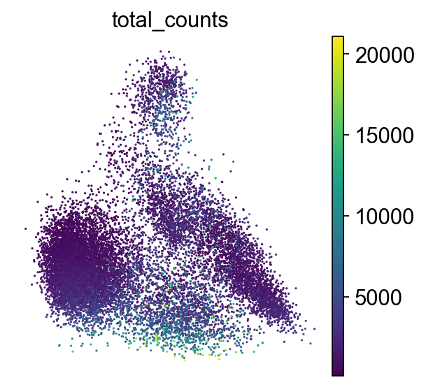
Direct PCA visualization is generally not very informative
PCA typically selects the top 10–50 principal components for downstream analyses; it is not commonly used as a final visualization.
t-SNE
# Compute t-SNE from PCA representation
sc.tl.tsne(adata, use_rep="X_pca")

# Visualize t-SNE results
sc.pl.tsne(adata, color="total_counts")
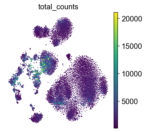
The t-SNE plot reveals clear cell cluster separation
⚠️ Important detail: t-SNE takes the PCA representation as input, not the raw data directly. This has two benefits:
- Reduces computational complexity
- Removes some noise, improving stability
UMAP
# Build the neighbor graph (required before UMAP)
sc.pp.neighbors(adata)

# Compute UMAP
sc.tl.umap(adata)

# Visualize UMAP results
sc.pl.umap(adata, color="total_counts")
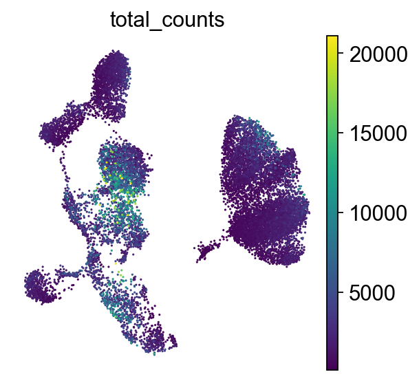
Compared to t-SNE, UMAP places clusters further apart and makes each cluster appear more compact
Note that UMAP requires constructing a k-nearest-neighbor (kNN) graph first. This graph encodes cell-to-cell "distances" based on transcriptomic similarity and will also be reused in the clustering step.
04 — Evaluating Quality Control Metrics
After dimensionality reduction, it's also an excellent opportunity to reassess data quality. We can overlay the QC metrics computed earlier onto the dimensionality reduction plot:
# Check multiple QC metrics on the UMAP plot
sc.pl.umap(
    adata,
    color=["total_counts", "pct_counts_mt", "scDblFinder_score", "scDblFinder_class"],
)
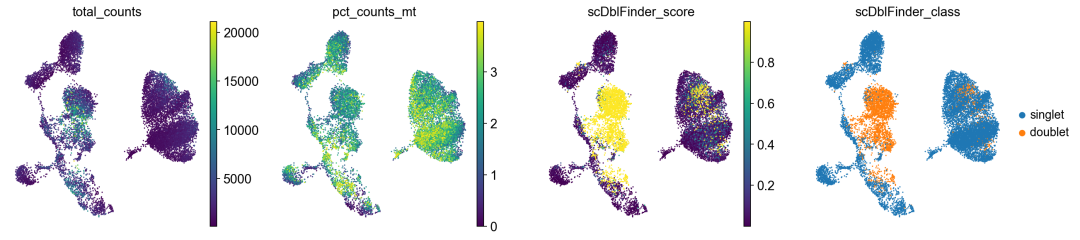
Doublets can be seen forming their own distinct cluster here
From the plot above, we can observe:
total_counts: distribution of total read counts per cellpct_counts_mt: mitochondrial gene percentagescDblFinder_score: doublet scorescDblFinder_class: doublet classification result
If cells with high doublet scores cluster together in the same region, it indicates that the dimensionality reduction has successfully captured data quality characteristics. These cells should be considered for removal in downstream analyses.
🔍 Editor's Note: Quality "Signals" Hidden in Dimensionality Reduction Plots
Dimensionality reduction plots do more than reveal cell type structure — they act as a magnifying glass for uncovering data quality issues. An experienced analyst can spot a variety of technical problems from anomalous patterns in these plots:
"Trailing" or "bridging" patterns between clusters: Thin connecting bands between cell clusters often indicate ambient RNA contamination. The contaminants, derived from lysed cell debris, have gene expression profiles intermediate between different cell types, and appear as "bridges" linking distinct clusters.
Aggregation of high mitochondrial expression: If cells with a high mitochondrial gene percentage clump together, they are likely dying or dead cells. As cell viability declines, cytoplasmic mRNA is preferentially lost while mitochondrial mRNA remains relatively stable, causing an abnormal spike in mitochondrial gene fraction.
Isolated clusters of low-gene-count cells: Cells with unusually few detected genes that form their own small cluster are likely empty droplets or cell debris — flag them for further filtering.
"Stratification" from batch effects: If cells of the same type from different batches appear clearly separated on the plot, this signals a batch effect that needs correction.
"Arc-shaped" cell cycle distributions: Sometimes cells arrange themselves along an arc in the plot, typically reflecting the continuous progression through cell cycle phases.
Parameter tuning tips:
- PCA: Choose the number of principal components based on cumulative variance explained (typically until ≥90% is captured)
- t-SNE: The
perplexityparameter controls the local-global trade-off- UMAP:
n_neighbors(number of neighbors) andmin_dist(minimum distance) are the key parameters to tune
Saving Results
# Save the dimensionality-reduced data
adata.write("s4d8_dimensionality_reduction.h5ad")
05 — Closing Notes
Dimensionality reduction is a pivotal bridge in the single-cell analysis pipeline. It converts the high-dimensional, feature-selected data into a compact, low-dimensional representation suitable for clustering and visualization. While each method has its strengths and limitations, the PCA + UMAP combination is the current mainstream choice in practice.
A few important caveats to keep in mind:
- Distances in a dimensionality reduction plot are not equivalent to biological distances in the original high-dimensional space — don't over-interpret spatial relationships.
- Good dimensionality reduction should clearly separate distinct cell types (though how much separation is expected depends on the biological question and the desired granularity — for example, T cells might form a single cluster at coarse resolution but need to be split into subtypes in sub-clustering analyses).
- Batch effects are a major confounding factor in dimensionality reduction. If cells from different batches are visibly separated — unless working with something like cancer, where high inter-sample variability is expected — batch correction will likely be necessary.
In the next chapter, we'll build on these dimensionality reduction results to perform cell clustering analysis, and really begin uncovering the hidden cell types and states in the data. Have you had any insights or gotchas when working with different dimensionality reduction methods?
The definitive single-cell tutorial series, written by field experts, is here! Star ✨ us to never miss an update.
Previous single-cell tutorials ⬇️:
Single-Cell Analysis with Theis Lab: Data Format Conversion — The Underlying Logic (Part 2) · 2025-05-16
Single-Cell Analysis with Theis Lab: What Does Quality Control Actually Control? · 2025-06-17
Single-Cell Analysis with Theis Lab: The Mathematics of Normalization · 2025-07-16
Forward · Bookmark · Like · In Reading
Originally posted on WeChat Official Account: bioinfo_studyroom