Single-Cell Analysis with Theis Lab: From Quality Control to the Count Matrix

Single-Cell Best PracticesCount Matrix Generation and Quality ControlChapter Overview — SECTION PREVIEW
- How do we assess the overall quality of single-cell data?
- How do we select high-quality cells and remove technical noise?
- Which tools and methods help us perform quality control most effectively?
- How do count matrices differ across quantification tools, and how do we choose the right one?
This section corresponds to Chapters 3.5 Count Matrix Quality Control, 3.6 Count Data Representation, and 3.7 Brief Discussion in the original book.
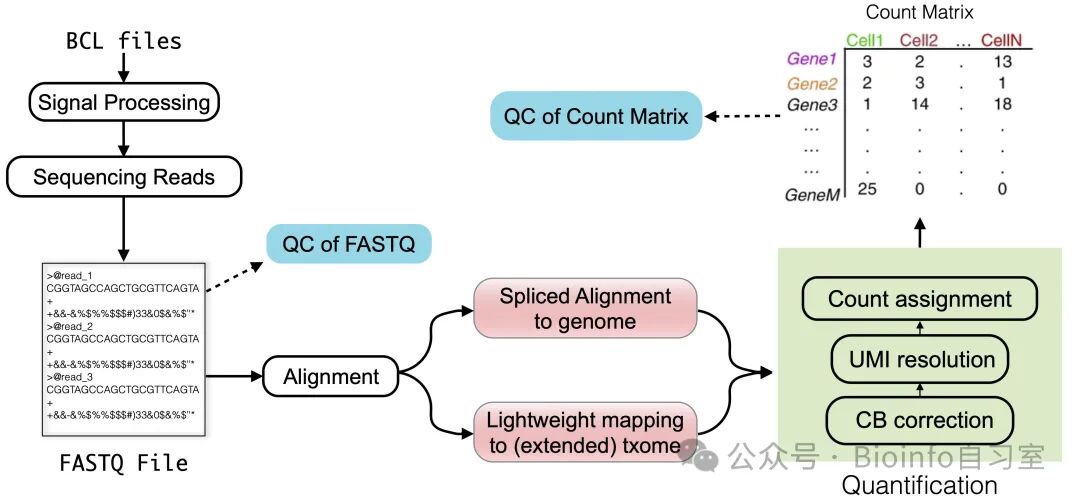
Figure 1. Chapter overview. We've finally reached the last piece of the upstream pipeline — the count matrix.
01 — Assessing Data Quality
In single-cell sequencing experiments, generating the count matrix is both the first step in data analysis and the final step in preprocessing. That doesn't mean we can dive straight into downstream analysis, however — quality control (QC) of the count matrix is an indispensable step. Only by applying rigorous QC can we ensure that all subsequent analyses are reliable and biologically meaningful.
The core goals of QC are to evaluate the overall quality of the sequencing data and to select "high-quality" cells while filtering out data that may be contaminated or affected by technical artifacts. Global metrics provide a rapid overview of sequencing performance, including:
- Overall mapping rate (fraction of mapped reads)
- UMI distribution per cell
- UMI deduplication rate
- Number of genes detected per cell
These metrics are typically generated automatically by quantification tools such as alevin and Cell Ranger, since they arise naturally during read alignment, cell barcode correction, and UMI resolution. Many tools also offer visualization of these metrics — for example, the Loupe Browser from 10x Genomics, alevinQC, and the reporting functionality of kb-python. Below, we use alevinQC as an example to walk through what a typical QC report contains.


1. Metadata and Summary Statistics
The first section of a QC report is typically a metadata and summary table covering tool runtime and version information; input file paths (FASTQ files, reference genome index, etc.); total read count; number of filtered cell barcodes; total deduplicated UMIs; and similar run-level statistics. This information provides the essential context for downstream analysis.
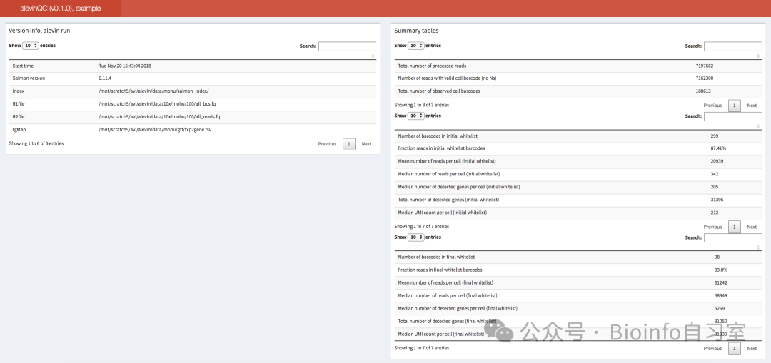
Figure 1: Summary statistics from the QC report
2. The Knee Plot and Initial Cell Filtering (Figure 2.1)
The knee plot (also called the barcode rank plot) is one of the most common QC visualizations, used to distinguish high-quality cells from empty droplets. The x-axis ranks cell barcodes in descending order of frequency, while the y-axis shows the number of reads (or UMIs) associated with each barcode. The plot typically displays a pronounced "knee" or inflection point, which marks the boundary between high-quality cells and low-quality barcodes (empty droplets or damaged cells). High-quality cells are usually highlighted in red.
3. Barcode Correction (Figure 2.2)
After initial filtering, the tool corrects cell barcode sequences. A comparison of read counts before and after correction helps assess the effectiveness of this step. Ideally, correction should not substantially alter the overall barcode distribution.
4. Genes Detected per Cell (Figure 2.3)
The number of genes detected per cell is another critical metric. A median of approximately 2,000 genes per cell is generally considered a reasonable expectation. If all cells show very low gene counts, it warrants re-examination of data quality.
5. Quantification Summary (lower half of Figure 2)
Finally, the QC report uses scatter plots to show the relationships among barcode frequency, total deduplicated UMI counts, and the number of genes with non-zero expression. These metrics should be positively correlated. Cells that deviate markedly from the overall trend may require further investigation.
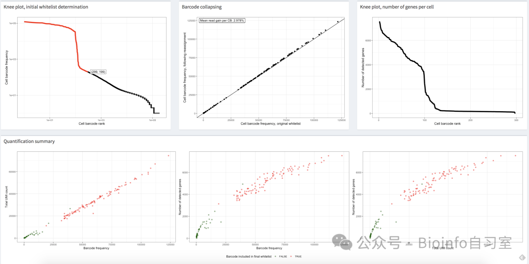
Figure 2: A series of QC plots from the alevinQC report


Scroll to see more
02 — Detecting Empty Droplets and Multiplets
In droplet-based single-cell sequencing, some barcodes may not have captured a genuine cell — instead, they reflect ambient RNA floating in the library. These "empty droplets" still generate sequencing reads, but their characteristics differ substantially from those of high-quality cells.
The most straightforward detection approach is the knee plot described above: by plotting the cumulative distribution of barcode frequencies, we identify the inflection point as the boundary between real cells and empty droplets. While simple and intuitive, this approach can sometimes fail to identify a clear inflection point automatically. More sophisticated alternatives use dedicated tools such as the emptyDrops function in DropletUtils, which integrates multiple metrics (UMI count, gene count, mitochondrial RNA fraction, etc.) to statistically assess whether each barcode corresponds to an empty droplet.
⚠️ Note: The choice of ambient RNA removal tool depends on the completeness of upstream outputs. If you have the unfiltered raw barcode matrix (
raw_bc_matrix), CellBender is generally considered the gold standard. If only the filtered matrix is available (i.e., some empty droplets have already been removed), tools such as DecontX can be used to estimate and correct for background noise.
Beyond empty droplets, we also need to identify doublets (or more generally, multiplets) — barcodes arising from droplets that captured two or more cells simultaneously. Doublet-containing barcodes typically show anomalous distributions in read count, UMI count, and gene expression profiles. A range of tools has been developed to flag these barcodes, including DoubletDetection, DoubletFinder, scDblFinder, and Scrublet. Once detected, potential doublets and multiplets can be removed or flagged for downstream analysis.
03 — Summary and Discussion
After completing raw data processing and quality control, it is important to keep in mind: the cell-by-gene count matrix is, at best, an approximation of the molecules that were actually sequenced from the original sample. Heuristics and simplifying assumptions are applied at multiple stages of the data processing pipeline to generate this matrix. For example, read alignment is never perfect; cell barcode correction introduces its own errors; precise UMI resolution is challenging; UMI collisions in multimapping reads are often ignored; and multiple priming sites — particularly in unspliced molecules — can violate the fundamental assumption of "one molecule, one UMI."
This chapter summarizes observations and recommendations from benchmark studies and review papers on commonly used preprocessing tools. It is worth emphasizing that the development and ongoing evaluation of raw data processing methods for both single-cell and single-nucleus RNA-seq is a continuing community effort. For this reason, testing multiple tools when analyzing your own data is both useful and advisable.
From a broad perspective, current mainstream tools are already quite robust and accurate. Some studies have found that in common downstream analyses such as clustering, the choice of preprocessing tool has less impact on the final results than choices made at other analytical stages. That said, other studies have noted that using lightweight pseudoalignment approaches restricted to the spliced transcriptome (e.g., alevin-fry without an extended index) can increase the risk of misalignment and spurious gene expression.
In practice, the choice of tool depends largely on the specific task and available computational resources:
- For standard single-cell RNA-seq analysis, lightweight pseudoalignment tools are a solid choice — they are typically much faster and more memory-efficient.
- For single-nucleus RNA-seq, alevin-fry is especially recommended: even when using an extended reference that includes unspliced sequences, it maintains low memory usage and produces a compact index.
- When you need to recover reads that do not align to the (extended) transcriptome, or when downstream analyses require precise genomic alignment coordinates (e.g., for differential transcript usage analysis with tools like sierra), full alignment-based approaches are more appropriate.
- Within alignment-based pipelines, tools such as STARsolo can match or exceed commercial-grade Cell Ranger, while being considerably faster, more memory-efficient, and producing nearly identical results.
04 — Closing Remarks
That wraps up the written portion of Chapter 3. After gaining a solid understanding of the principles behind each upstream step, you can now approach tool selection with greater confidence. The lightweight methods recommended by the book's authors — such as alevin-fry — are also well-suited for researchers with limited computational resources and can run smoothly on a personal laptop.
In the next installment, we'll move into hands-on practice, walking through the workflow of this lightweight tool with a concrete worked example. Stay tuned!
Originally posted on WeChat Official Account: bioinfo_studyroom