Learning Single-Cell Analysis with Theis Lab: Measuring RNA Velocity

Single-Cell Best Practices
Pseudotime
Chapter Overview — SECTION PREVIEW
1. How does RNA velocity infer dynamic developmental directionality from static data?
2. Splicing kinetics models: How does the ratio of unspliced to spliced RNA hint at the "future trajectory" of gene expression?
3. Two mainstream models: What are the assumptions and limitations of the Steady-state model and the EM (dynamical) model?
4. Hands-on tutorial: A step-by-step walkthrough of the scVelo pipeline using the classic pancreatic endocrine development dataset
5. Pitfall guide: RNA velocity isn't a silver bullet — when does it fail?
This chapter corresponds to Chapter 14 (RNA Velocity) of the original book.
As mentioned in the previous chapter, single-cell RNA sequencing is a destructive process. Once a cell is sequenced, it is lysed, and we can no longer track changes in the same cell over time. In other words, single-cell data is inherently a "snapshot", not a continuous time-lapse recording.
Imagine you took a photograph at a train station showing passengers standing at various positions. Could you guess who just arrived and who is about to board? Single-cell data faces exactly this kind of challenge — we only have information from one time point, yet we want to infer a cell's "past" and "future".
Traditional trajectory inference (TI) methods can help us locate cells' relative positions within the developmental landscape, but they typically only tell us where cells are, not where they're going — in other words, they lack directionality.
RNA velocity was developed precisely to fill this gap. It leverages a piece of information in scRNA-seq data that is often overlooked — the ratio of unspliced RNA to spliced RNA — to infer the direction and rate of gene expression changes.
The Biological Basis of RNA Velocity
The Journey from DNA to Mature mRNA
Let's start with a quick refresher. Gene expression is a dynamic process that can be broken down into the following steps:
Transcription: DNA is transcribed into pre-mRNA (precursor mRNA), also called unspliced RNA. At this stage, the RNA contains both exons and introns.
Splicing: Introns are excised and exons are joined together to form mature mRNA, i.e., spliced RNA.
Degradation: Mature mRNA is eventually degraded by the cell.
Think of this process as an assembly line: raw materials (unspliced) come in, are processed into finished products (spliced), and the finished products eventually reach the end of their life. If raw materials are piling up on the line, it means production is "ramping up"; conversely, if raw materials are dwindling while finished products remain, production is "winding down."
The Core Mathematical Model
The central idea behind RNA velocity can be described by two ordinary differential equations:
Where:
- : abundance of unspliced RNA
- : abundance of spliced RNA
- : transcription rate
- : splicing rate
- : degradation rate
RNA velocity is defined as the rate of change of spliced RNA abundance over time, i.e., .
★
Editor's Note: This model assumes that each gene's kinetics are independent — i.e., the transcription rate of gene A does not affect gene B. While this is a simplifying assumption, it serves as a reasonable approximation in many scenarios.
Two Mainstream Approaches to Parameter Inference
Since single-cell data lacks real time labels, we cannot directly use traditional methods for estimating kinetic parameters. RNA velocity algorithms take a different approach, inferring parameters by analyzing the phase portrait — i.e., a scatter plot of unspliced vs. spliced RNA abundance.
The Steady-State Model
This was the earliest implementation of RNA velocity (La Manno et al., Nature 2018), based on the following core assumptions:
- The kinetics have reached steady state (equilibrium)
- Transcription, splicing, and degradation rates remain constant
- All genes share the same splicing rate
Under steady-state conditions, the phase portrait takes on a characteristic "almond shape": the upper arc corresponds to the gene induction phase, while the lower arc corresponds to the repression phase (panel d below).
The steady-state model estimates the steady-state ratio by performing linear regression on extreme quantiles of the data, then defines each cell's residual relative to this fitted line as its RNA velocity.
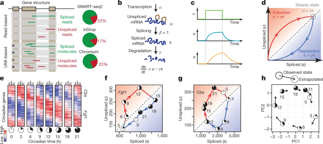 Steady-state model schematic. Source: La Manno et al., Nature 2018
The EM Model (Dynamical Model)
To overcome the limitations of the steady-state model, scVelo introduced a more flexible EM model (also known as the dynamical model).
Key improvements:
- No longer assumes steady state has been reached
- Allows each gene to have its own independent splicing rate
- Uses all data points for parameter inference
- Simultaneously infers each cell's latent time
The algorithm uses an Expectation-Maximization (EM) framework:
- E-step: Estimate each cell's latent time and state (induction, repression, or steady state)
- M-step: Update model parameters based on E-step results
★
Editor's Note: Although the EM model is more powerful, it's not a cure-all. It still assumes constant rates and has certain requirements for the phase portrait shape. If a gene's phase portrait in your data doesn't resemble an "almond" at all, the model fit may be problematic.
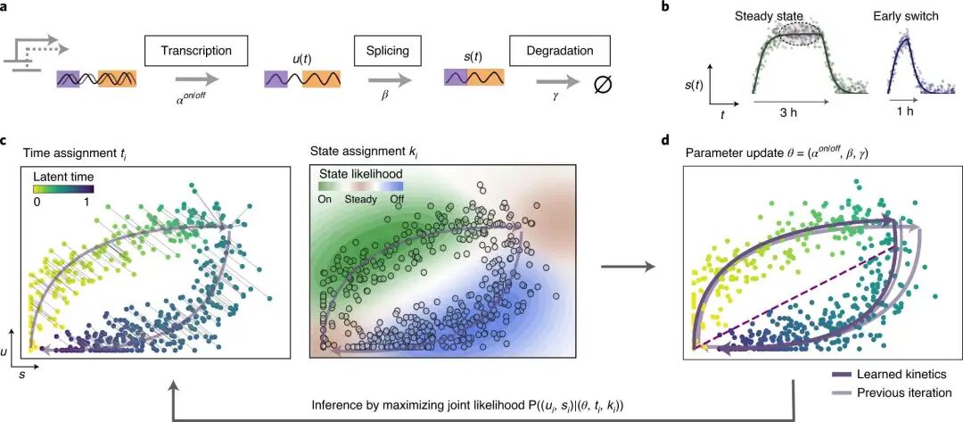 Dynamical model schematic. Source: Bergen et al., Nat Biotechnol 2020
Hands-On: Pancreatic Endocrine Development Analysis
Let's walk through an RNA velocity analysis using scVelo with the classic pancreatic endocrine development dataset.
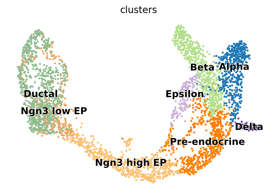
This dataset comes from a study published by Bastidas-Ponce et al. in 2019, which describes the differentiation of pancreatic pre-endocrine cells (Ductal, Ngn3 low EP, Ngn3 high EP, Pre-endocrine) into four mature endocrine cell types (Alpha, Beta, Delta, Epsilon).
Environment Setup and Data Loading
from pathlib import Path
import scanpy as sc
import scvelo as scv

scv.settings.set_figure_params("scvelo")

DATA_DIR = Path("../../data/")
DATA_DIR.mkdir(parents=True, exist_ok=True)
FILE_PATH = DATA_DIR / "pancreas.h5ad"

adata = scv.datasets.pancreas(file_path=FILE_PATH)
adata
Output:
AnnData object with n_obs × n_vars = 3696 × 27998
    obs: 'clusters_coarse', 'clusters', 'S_score', 'G2M_score'
    var: 'highly_variable_genes'
    uns: 'clusters_coarse_colors', 'clusters_colors', 'day_colors', 'neighbors', 'pca'
    obsm: 'X_pca', 'X_umap'
    layers: 'spliced', 'unspliced'
    obsp: 'distances', 'connectivities'
Note that the layers slot contains both spliced and unspliced data — these are the essential inputs for RNA velocity analysis. If your data lacks these two layers, you'll need to re-process the raw FASTQ files using a dedicated quantification tool (e.g., alevin-fry, kallisto bustools, etc.).
Data Preprocessing
scRNA-seq data is typically noisy and requires preprocessing:
scv.pp.filter_and_normalize(adata, min_shared_counts=20, n_top_genes=2000)
Output:
Filtered out 20801 genes that are detected 20 counts (shared).
Normalized count data: X, spliced, unspliced.
Extracted 2000 highly variable genes.
Logarithmized X.
This step accomplishes the following:
- Filters out lowly expressed genes (both spliced and unspliced must have at least 20 counts)
- Library size normalization
- Selection of the top 2,000 highly variable genes (HVGs)
- Log transformation
Next, we compute PCA and the neighborhood graph, and perform neighborhood smoothing (moment smoothing) on the expression values:
sc.tl.pca(adata)
sc.pp.neighbors(adata)
scv.pp.moments(adata, n_pcs=None, n_neighbors=None)
Output:
computing moments based on connectivities
    finished (0:00:00) --> added
    'Ms' and 'Mu', moments of un/spliced abundances (adata.layers)
★
Editor's Note: Neighborhood smoothing is a critical step in RNA velocity analysis. Because single-cell data is extremely sparse, using raw counts directly would produce excessively noisy phase portraits. The smoothed values
MsandMurepresent the "smoothed expression" of spliced and unspliced RNA, respectively, and serve as the foundation for downstream modeling.
Let's visualize our data:
scv.pl.scatter(adata, basis="umap", color="clusters")
Steady-State Model: RNA Velocity Inference
First, we compute RNA velocity using the steady-state model (mode="deterministic"):
scv.tl.velocity(adata, mode="deterministic")
Output:
computing velocities
    finished (0:00:00) --> added
    'velocity', velocity vectors for each individual cell (adata.layers)
Next, compute the velocity graph and visualize it as a stream plot:
scv.tl.velocity_graph(adata, n_jobs=8)
scv.pl.velocity_embedding_stream(adata, basis="umap", color="clusters")
Output:
computing velocity graph (using 8/96 cores)
    finished (0:00:05) --> added
    'velocity_graph', sparse matrix with cosine correlations (adata.uns)
computing velocity embedding
    finished (0:00:00) --> added
    'velocity_umap', embedded velocity vectors (adata.obsm)
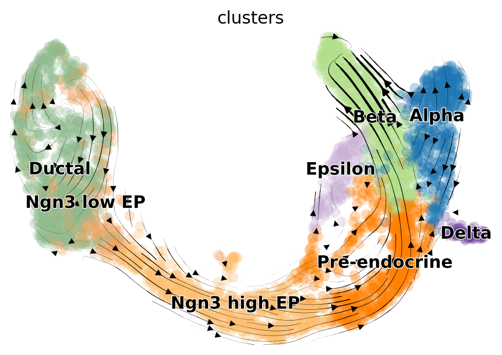 Steady-state velocity stream
EM Model (Dynamical Model): RNA Velocity Inference
Now let's use the more advanced EM model. The first step is to recover the splicing kinetic parameters:
scv.tl.recover_dynamics(adata, n_jobs=8)
Output:
recovering dynamics (using 8/96 cores)
    finished (0:01:00) --> added
    'fit_pars', fitted parameters for splicing dynamics (adata.var)
★
Editor's Note: This step is the heart of the EM model and can take a while. It independently fits the splicing kinetic parameters (α, β, γ) for each gene and estimates the latent time for each cell at each gene.
We can inspect which genes were best fit (sorted by fit_likelihood):
top_genes = adata.var["fit_likelihood"].sort_values(ascending=False).index
scv.pl.scatter(adata, basis=top_genes[:5], color="clusters", frameon=False)
 Top genes phase portraits
★
Editor's Note: The figure above shows the phase portraits of the five genes with the highest fit quality. The purple curve is the model-fitted trajectory, and the dashed line represents the steady-state ratio. You can see that Pcsk2, Top2a, and Ppp1r1a display a clear "almond shape," indicating a reliable fit. In contrast, the phase portraits of Nfib and Ghrl are less ideal, and their results should be interpreted with caution.
With the kinetic parameters in hand, we can compute the dynamical model's velocity:
scv.tl.velocity(adata, mode="dynamical")
scv.tl.velocity_graph(adata, n_jobs=8)
scv.pl.velocity_embedding_stream(adata, basis="umap")
Output:
computing velocities
    finished (0:00:02) --> added
    'velocity', velocity vectors for each individual cell (adata.layers)
computing velocity graph (using 8/96 cores)
    finished (0:00:02) --> added
    'velocity_graph', sparse matrix with cosine correlations (adata.uns)
computing velocity embedding
    finished (0:00:00) --> added
    'velocity_umap', embedded velocity vectors (adata.obsm)
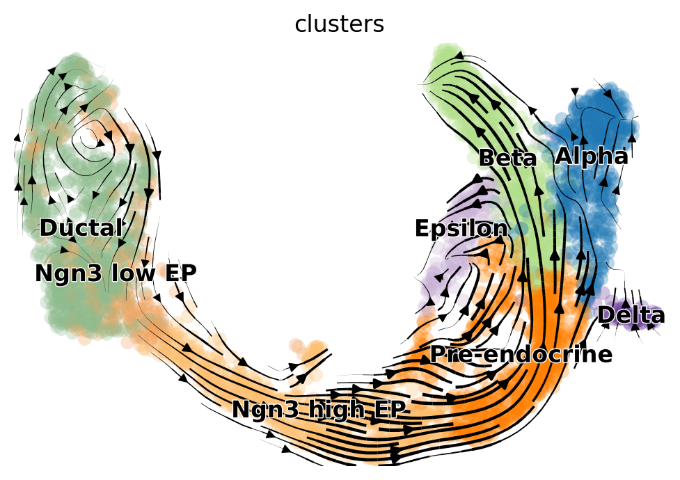 EM model velocity stream
Comparing the Two Models
Comparing the results of the two models reveals several key differences:
- The EM model better captures the cell cycle of Ductal cells: A clear rotational pattern is visible in the stream plot.
- The steady-state model suffers from a "backflow" artifact: Unreasonable reverse arrows appear pointing from Alpha back toward Pre-endocrine cells.
★
Editor's Note: Although 2D stream plots are intuitive and easy to read, they are ultimately projections of high-dimensional velocity vectors into low-dimensional space, which can introduce artifacts. For rigorous quantitative analysis, we recommend using downstream tools like CellRank to perform fate inference in the original high-dimensional space.
Key Takeaways and Pitfall Guide
When RNA Velocity Works Well
The time scale of the developmental process must be comparable to the RNA half-life
- ✅ Fast processes such as embryonic development and endocrine differentiation
- ❌ Long-term chronic diseases like Alzheimer's or Parkinson's
- ❌ Homeostatic systems like peripheral blood mononuclear cells (PBMCs), where there is no active transition between mature cell types
The phase portrait should display the expected "almond shape"
- If a gene's phase portrait has an unusual shape (e.g., multiple branches), exercise caution or consider splitting the data into separate lineages for analysis
Common Failure Modes
Violation of model assumptions
- For example, transcription rates change dramatically during erythrocyte maturation, violating the constant-rate assumption
Misleading low-dimensional projections
- Stream plots are highly sensitive to gene selection and plotting parameters
- Projection quality tends to be poor at the edges of the embedding space
Impact of rare cell types
- As noted above, Epsilon cells are very few in number — only a handful of data points appear in the phase portrait, making the model fit unreliable
Best Practices
- Inspect phase portraits: Before interpreting results, always examine the phase portraits of key genes to verify model fit quality
- Use CellRank for downstream analysis: Avoid over-reliance on 2D stream plots; perform fate inference in the high-dimensional space instead
- Incorporate prior knowledge: If velocity directions contradict known biology, the model is likely failing
Emerging Directions and Recent Advances
The RNA velocity field is evolving rapidly. Several new methods are addressing the limitations of current models:
| Method/Tool | Key Improvement |
|---|---|
| CellRank | Performs cell fate inference in high-dimensional space, avoiding artifacts from low-dimensional projections |
| veloVI | Variational inference framework that provides uncertainty quantification for velocity estimates |
| DeepVelo | Uses neural ODEs for modeling, allowing non-constant rates |
| VeloVAE | Works directly with raw counts, avoiding biases introduced by preprocessing |
★
Editor's Note: If you want a deeper understanding of the theory and limitations of RNA velocity, we highly recommend the review by Bergen et al. (2021) in Molecular Systems Biology: "RNA velocity — current challenges and future perspectives."
To access the original English text and complete code for this chapter, reply scbp14 in the backend.
References
- La Manno G, et al. RNA velocity of single cells. Nature. 2018.
- Bergen V, et al. Generalizing RNA velocity to transient cell states through dynamical modeling. Nature Biotechnology. 2020.
- Bergen V, et al. RNA velocity—current challenges and future perspectives. Molecular Systems Biology. 2021.
- Bastidas-Ponce A, et al. Massive single-cell mRNA profiling reveals a detailed roadmap for pancreatic endocrinogenesis. Development. 2019.
- Lange M, et al. CellRank for directed single-cell fate mapping. Nature Methods. 2022.
- Gayoso A, et al. Deep generative modeling of transcriptional dynamics for RNA velocity analysis in single cells. Nature Biotechnology. 2022.
All bioinformatics enthusiasts are welcome to join the Bioinfo Study Room community! Feel free to reach out to us via the backend.
Originally posted on WeChat Official Account: bioinfo_studyroom