Statistics Self-Help Guide 5: It's Time to See Through the Bar Chart
In 2014, the editorial team at Nature Methods published a forceful op-ed: "Kick the bar chart habit."
The editors were blunt: bar charts are severely overused, and in many situations they simply cannot accurately convey the true nature of statistical data.
So what should you use instead?
The answer is the box plot (also known as a box-and-whisker plot).
This article will walk you through everything you need to know about this "small but mighty" visualization tool.
The "Sweet Trap" of Bar Charts
Bar charts are best suited for displaying count data: population sizes, sales figures, student enrollment numbers.
For these types of data, the zero point has a clear, meaningful interpretation—a population of zero means nobody is there; a sales figure of zero means nothing was sold.
But in biomedical research, we're typically working with statistical sample data: mouse body weights, gene expression levels, cell viability measurements.
For these data, the zero point is usually not particularly meaningful. The difference between a gene expression value of 10 and 20 is fundamentally no different from the difference between 0 and 10.
More importantly, the distributions of these data can be complex—skewed, bimodal, riddled with outliers.
Consider the following example with four datasets sharing nearly identical summary statistics:
| Distribution | Median (m) | IQR |
|---|---|---|
| Uniform | 0 | 1.74 |
| Normal | 0 | 1.35 |
| Mildly right-skewed | −0.12 | 1.33 |
| Strongly right-skewed | −0.19 | 1.37 |
If you only look at the mean and standard deviation, these four groups appear almost identical. Yet in reality, their distributional shapes are completely different.
The uniform distribution spreads flat across the entire range; the normal distribution forms the classic bell curve; and the right-skewed distributions trail off in long "tails" to the right.
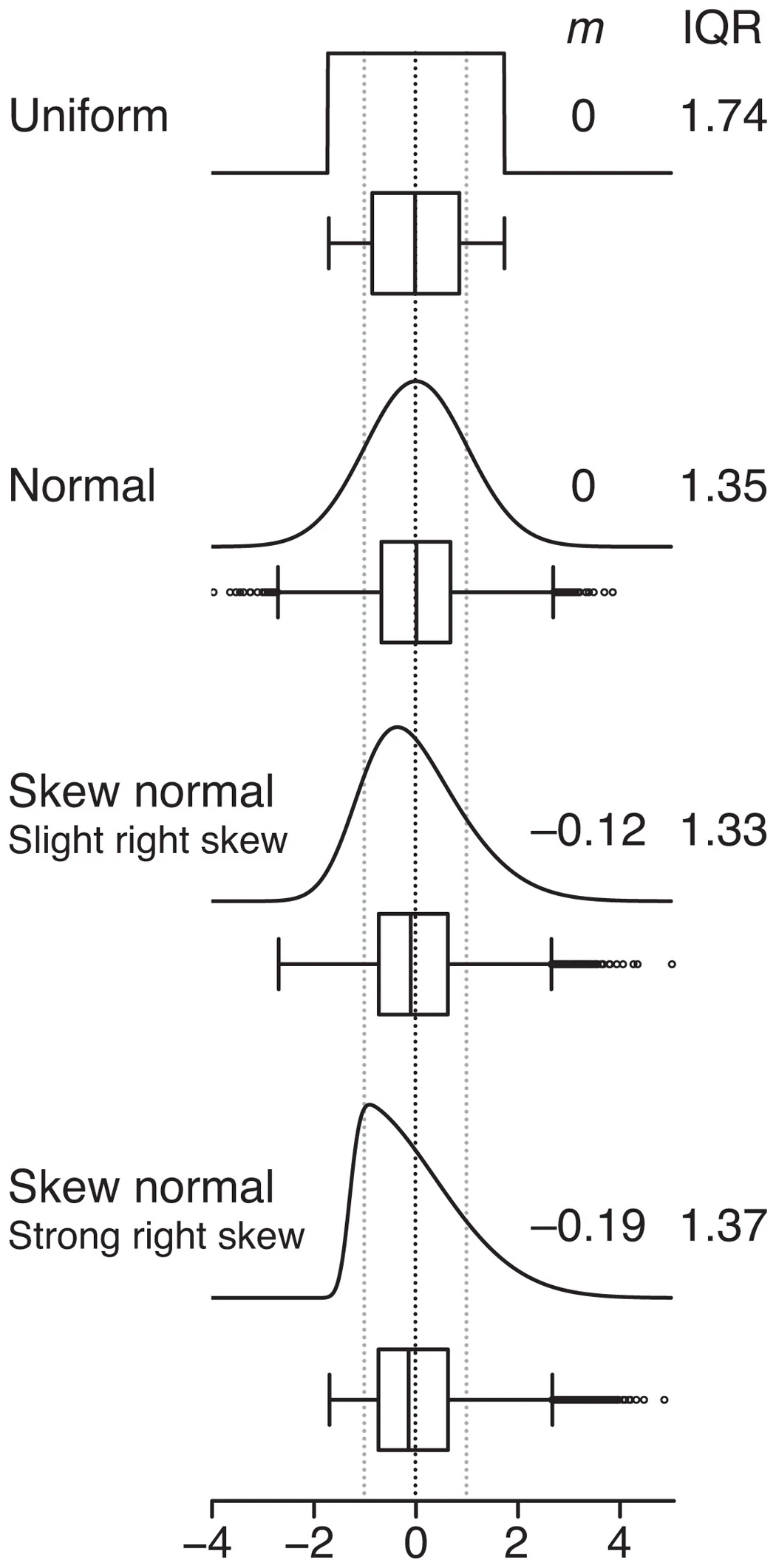 Box plot shapes and their corresponding data distributions
This is the core problem: simple summary statistics (mean, standard deviation) can mask fundamental differences in data structure, and bar charts amplify that concealment further.
When we display this kind of data as a bar chart, the "visual weight" of the bars misleads us into focusing on the distance between the mean and zero—while completely ignoring the true shape of the data distribution.
The Box Plot's "Five-Dimensional" View
The power of the box plot lies in its ability to simultaneously display five key summary statistics in a single compact graphic.
Where is the data concentrated? How spread out is it? Are there extreme values? The box plot answers all of these questions at once.
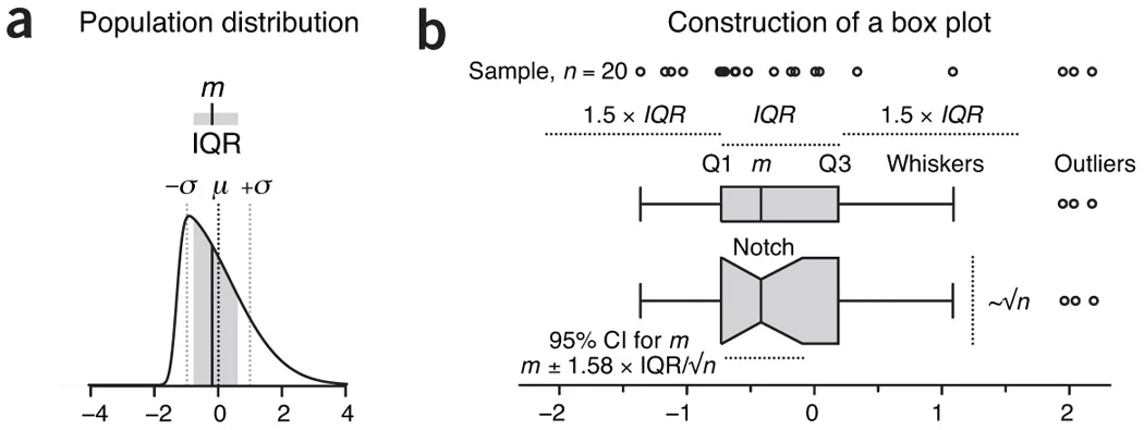 Components of a box plot
The Box: The Data's "Core Zone"
The central rectangle in a box plot represents the interquartile range (IQR = Q3 − Q1)—the range occupied by the middle 50% of the data.
The lower boundary of the box is the first quartile (Q1, the 25th percentile), the upper boundary is the third quartile (Q3, the 75th percentile), and the line inside the box is the median (Q2, the 50th percentile).
Importantly, this median line is not necessarily in the center of the box!
If it's closer to the top of the box, the data is right-skewed (there are more small values). If it's closer to the bottom, the data is left-skewed (there are more large values).
This asymmetry is completely invisible in a bar chart.
The Whiskers: "Antennae" for Reasonable Variation
The "whiskers" extending from either end of the box represent the reasonable range of variation in the data. The most commonly used convention is Tukey-style whiskers:
- The upper whisker extends to the largest data point that does not exceed Q3 + 1.5 × IQR
- The lower whisker extends to the smallest data point that is not less than Q1 − 1.5 × IQR
Why the factor of 1.5?
This coefficient corresponds to ±2.7σ of a normal distribution, covering approximately 99.3% of the data.
Data points that fall beyond the whiskers are plotted individually and are called outliers.
Outliers aren't necessarily "bad data." They could be measurement errors, genuine biological extremes, or a signal that your data distribution simply isn't normal.
Optional "Power-Ups"
A notch can be added to display the 95% confidence interval of the median (calculated as approximately ±1.58 × IQR / √n).
If the notches of two box plots don't overlap, the medians are likely to be significantly different.
However, for small samples (n < 5), notches can extend beyond the box boundaries—in which case, don't use them; it just looks wrong.
Box width can also be made proportional to √n, providing a visual representation of relative sample sizes.
Why √n? Because statistical precision improves in proportion to √n.
Reading Data "Physique" from a Box Plot
Once you've mastered the basic elements, you can extract much more from a box plot.
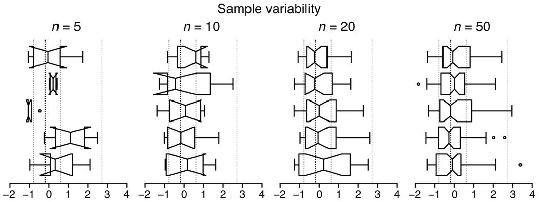 Box plots reflecting sample variability
A box plot of a symmetric distribution has the median near the center of the box, whiskers of similar length above and below, and looks balanced—suggesting data close to a normal distribution.
A right-skewed (positively skewed) distribution looks different: the median sits toward the lower portion of the box, the upper whisker is noticeably longer than the lower whisker, and outliers tend to appear on the right side. This kind of distribution is extremely common in biology—income distributions and gene expression levels are classic examples.
A left-skewed (negatively skewed) distribution is the mirror image: the median sits near the top of the box and the lower whisker is longer.
Sample size also has a visible effect on box plots.
With small samples (n = 5–10), the box plot components are highly variable and notches may be very wide—even extending outside the box.
As sample size increases, box plots stabilize and become more representative of the underlying population distribution.
This is precisely why you should plot individual data points (rather than a box plot) when n < 5.
Why Are Quartiles More "Robust" Than Means?
Many people ask: why use the median and quartiles instead of the mean and standard deviation?
The answer comes down to robustness.
Consider this dataset: 1, 2, 3, 4, 5. The mean is 3 and so is the median—they look the same.
Now change the last data point to an outlier: 1, 2, 3, 4, 1000. The mean shoots up to 202, while the median remains 3.
A single outlier shifts the mean by nearly a hundredfold—but the median doesn't budge.
This is the "robustness" of the median: its insensitivity to extreme values makes it a better representation of the "typical level" of the data.
The same applies to the IQR. In the first dataset, the standard deviation is about 1.58 and the IQR is 3. Add the outlier, and the standard deviation explodes to 446—while the IQR stays at 3.
Of course, this doesn't mean the mean and standard deviation are useless.
If your data is approximately normally distributed, has no obvious outliers, and your sample size is large, the mean and standard deviation are actually more statistically efficient because they leverage information from every data point.
The problem is that with small samples, it's hard to tell whether a distribution is normal—and in that case, using the median is the safer choice.
Box Plot vs. Bar Chart: Substance vs. Spectacle
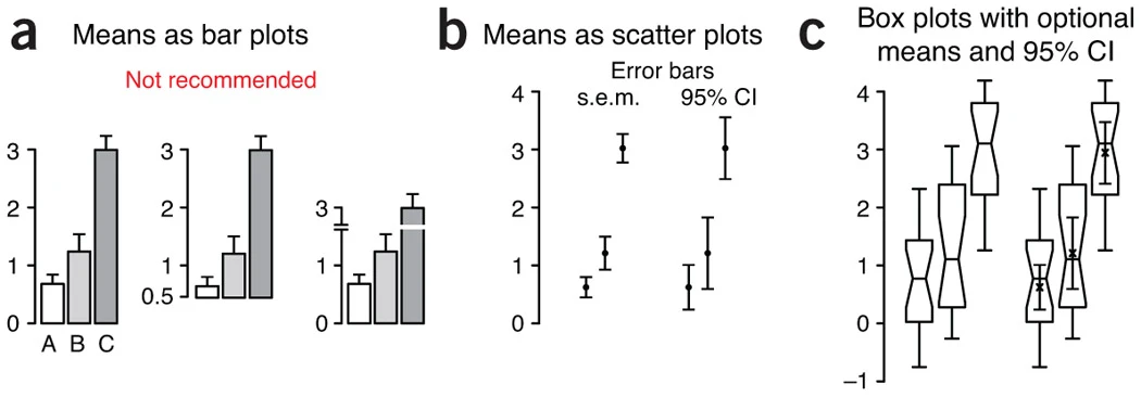 Comparison of different visualization approaches
Bar charts have three fatal flaws.
First, the "false gravity" of the zero point—the visual weight of the bars misleads you into focusing on the distance between the mean and zero, even though the zero point is often meaningless for statistical sample data.
Second, the baseline can "lie"—changing the starting point of the y-axis makes the relative heights of the bars look entirely different, and axis truncation can make small differences look dramatic.
Third, too little information—showing only the mean and an error bar tells you nothing about the distribution or outliers.
Box plots are a completely different story. They display five summary statistics (minimum, Q1, median, Q3, maximum), reveal symmetry and spread, and can directly highlight outliers.
Moreover, box plots make no distributional assumptions—they work equally well for skewed data and data with outliers, thanks to the robustness of quartiles.
And box plots only require a minimum of 5 data points (though 10+ is recommended), whereas bar charts arguably need at least 30 samples to be meaningful.
Practical Guidance: Which Chart When?
Here's a simple decision framework:
Use a bar chart: for displaying count or proportion data (e.g., population of three cities), where the data type is not a statistical sample
Use a box plot: for statistical sample data (e.g., body weights across three groups of mice), when the data may be skewed or have outliers, when sample sizes are modest (5–30), and when you want to show the shape of the data distribution
Use a mean-plus-error-bar plot: when data is approximately normally distributed, when you want to emphasize a trend (e.g., a time series), and when sample sizes are large (n ≥ 14)
Pitfalls and How to Avoid Them
Box plots are great—but there are a few things to watch out for.
The sample size problem is most easily overlooked. When n < 5, quartile estimates are extremely unstable—just plot the individual data points. When n = 5–10, box plots are acceptable but require cautious interpretation; always report the sample size. Box plots only become reliably informative at n ≥ 10.
Unclear labeling is another major issue. Many published box plots don't specify the sample size, the whisker definition, or whether box width encodes sample size.
It's best practice to state these details explicitly in the figure legend. The BoxPlotR tool (http://boxplot.tyerslab.com/), recommended by Nature Methods, automatically generates standardized figure legends—worth using as a reference.
There are also several common misreadings to avoid:
- Treating the box boundaries as "mean ± standard error" (wrong—they're Q1 and Q3)
- Treating the median line as "the mean" (they often differ)
- Concluding "significant difference" just because notches don't overlap (formal statistical testing is still required)
Finally, be aware of subtle differences between software implementations.
Different software packages calculate quartiles slightly differently—some use simple averaging, others use linear interpolation; R uses "hinges" rather than strict quartiles. The differences are usually small, but can matter for edge cases like tied values. Pick one tool and be consistent.
A Special Note for Bioinformaticians
As a bioinformatics analyst, the omics data you work with every day has its own peculiarities.
RNA-seq expression values are highly skewed—most genes are lowly expressed, and a small number are highly expressed. ChIP-seq peak intensities follow a similar pattern: most are weak, a few are very strong.
There's also the issue of batch effects: samples from different batches can show systematic shifts, and a box plot makes this immediately apparent.
And then there are outlier samples—a sample with poor quality or from a distinct subpopulation will stand out immediately on a box plot.
Displaying this kind of data as a bar chart is essentially self-deception. A box plot will tell you what the data actually looks like.
Single-cell data is even more extreme—many genes have zero expression across many cells, with only a small fraction of cells and genes showing high expression.
Using the mean to summarize this type of data is meaningless. You must use the median or another robust statistic.
Quick Start (R)
# Basic box plot
boxplot(data1, data2, data3,
        names = c("Group A", "Group B", "Group C"),
        ylab = "Expression level",
        col = "lightblue")

# Add notch and overlay individual data points
boxplot(data1, data2, data3, notch = TRUE)
stripchart(list(data1, data2, data3),
          vertical = TRUE, method = "jitter",
          add = TRUE, pch = 20, col = "red")
Online Tool: BoxPlotR
Not a programmer? Try BoxPlotR (http://boxplot.tyerslab.com/). The interface is very user-friendly—paste in your data or upload a file, choose your whisker type, decide whether to add a notch, and the tool automatically generates a standardized figure legend and lets you download a high-resolution vector graphic. The best part: it generates publication-ready legend text that you can copy directly into your paper.
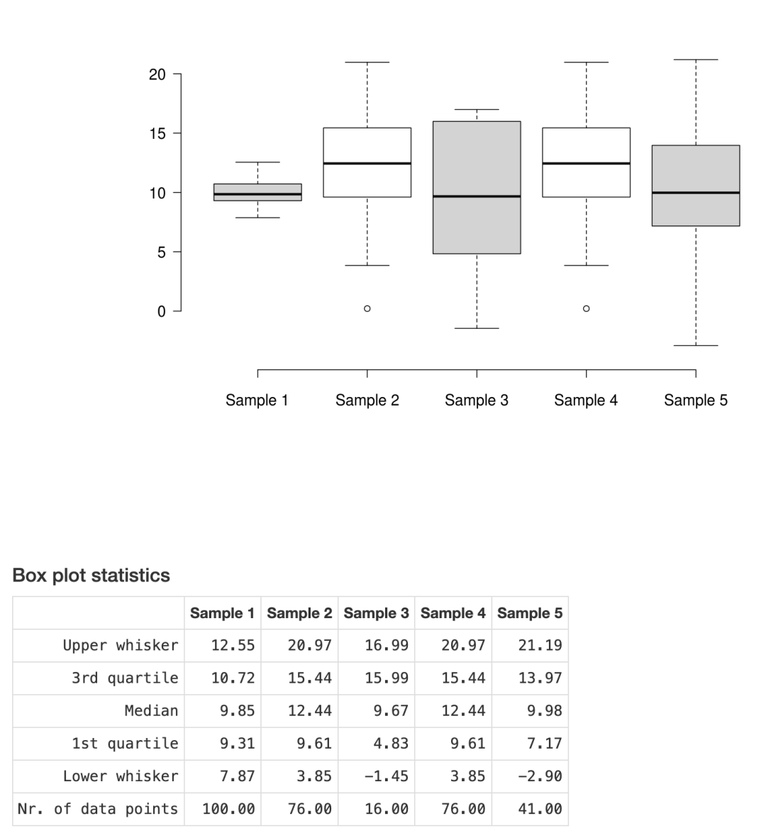 BoxPlotR example output
Closing Thoughts
A decade ago, the Nature Methods editorial team called on the scientific community to "kick the bar chart habit." Ten years later, things have improved—but bar charts are still everywhere. Part of the reason is inertia, and part of it is tooling (Excel still can't easily generate a proper box plot). But as the next generation of researchers, we have a responsibility to change this.
The box plot isn't the only answer, but it's a good place to start. The next time you're about to make a figure, ask yourself three questions: What type of data do I have? What does its distribution look like? What message do I want to convey? Then choose the most appropriate visualization based on those answers.
Remember: figures are for communication, not decoration. Let's tell the story of our data in a better way.
References
Krzywinski, M. & Altman, N. Visualizing samples with box plots. Nature Methods 11, 119–120 (2014).
Spitzer, M. et al. BoxPlotR: a web tool for generation of box plots. Nature Methods 11, 121–122 (2014).
Nature Methods Editorial. Kick the bar chart habit. Nature Methods 11, 113 (2014).
Originally posted on WeChat Official Account: bioinfo_studyroom